LOG_ID: en/001 // STATUS: OPEN
Creating the Website
Process in which this website was created.
UPDATED: Mon Aug 03 2026 00:00:00 GMT+0000 (Coordinated Universal Time)
WORDCOUNT: 1225

Process in which this website was created.
UPDATED: Mon Aug 03 2026 00:00:00 GMT+0000 (Coordinated Universal Time)
WORDCOUNT: 1225
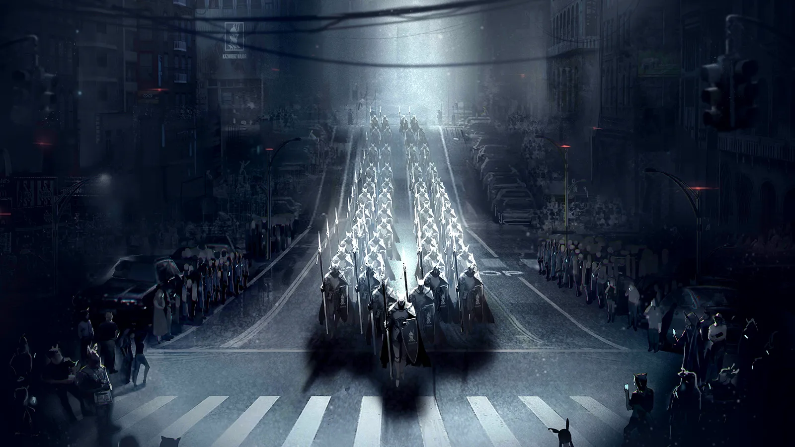
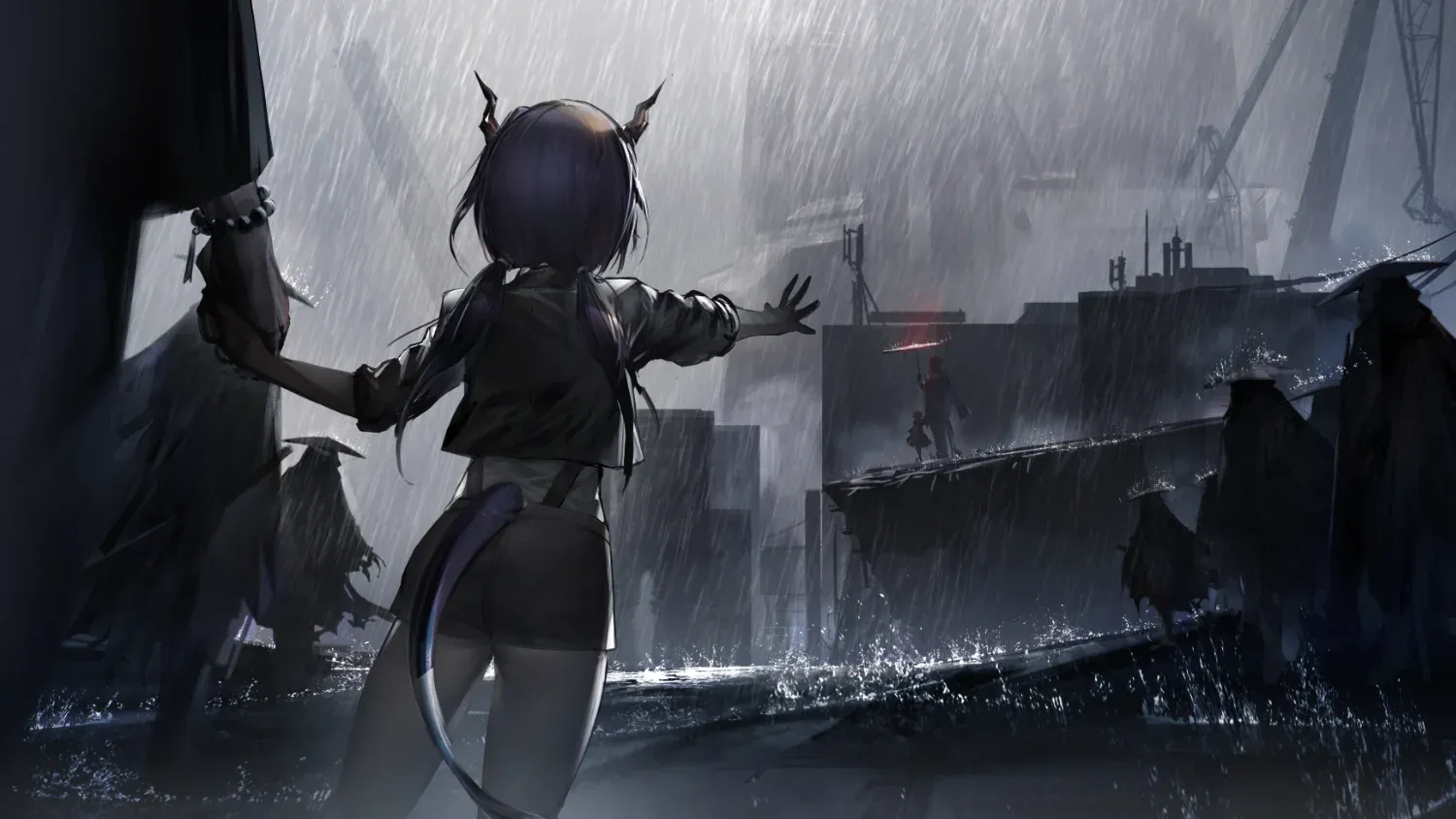
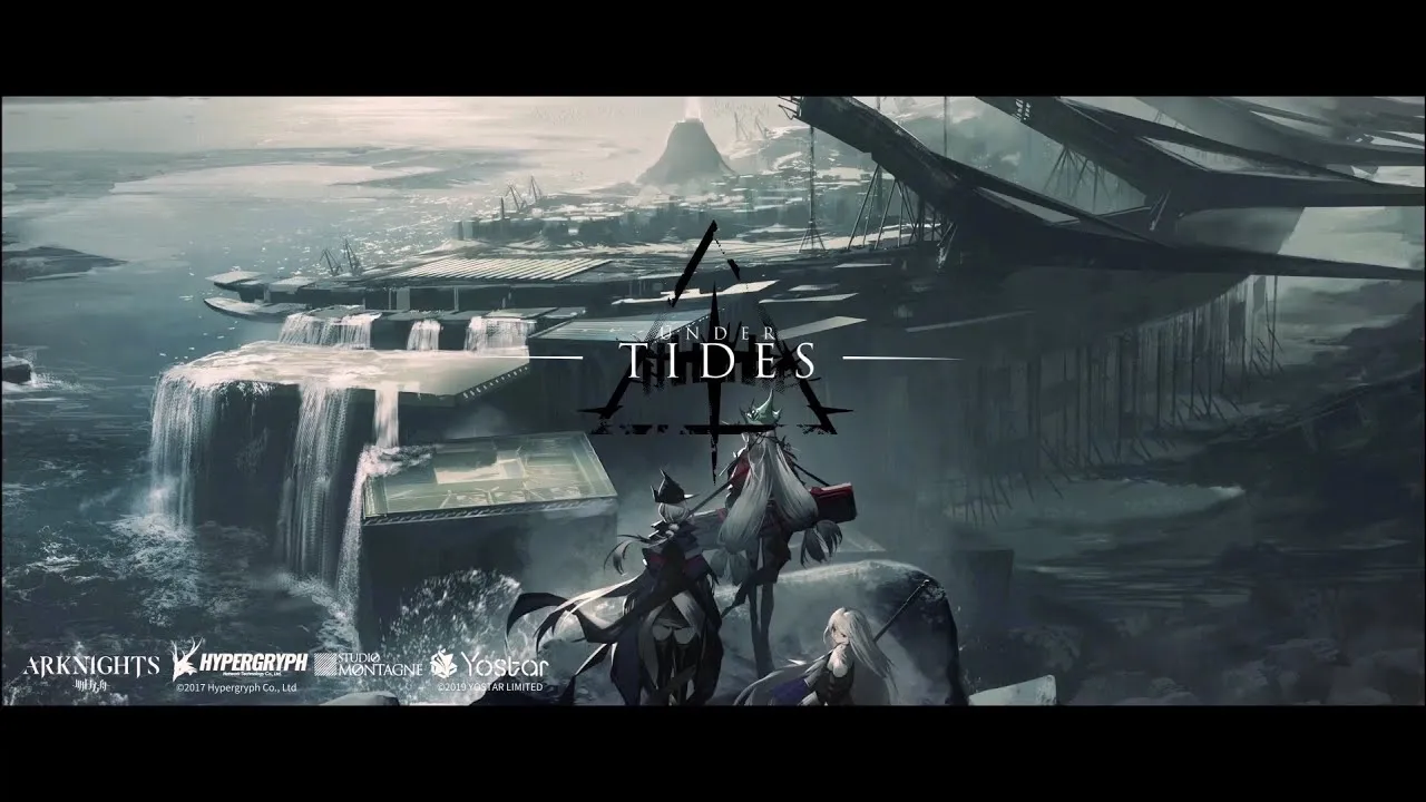
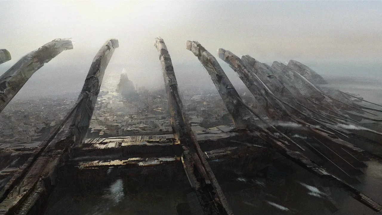
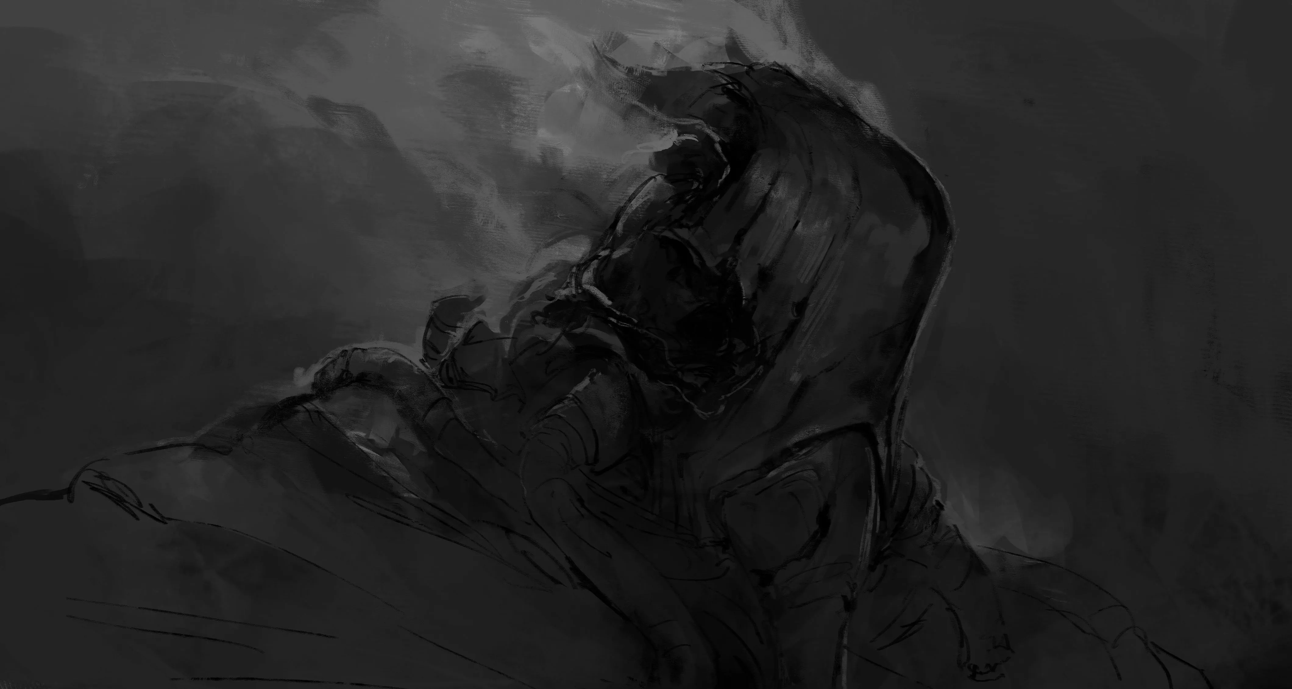
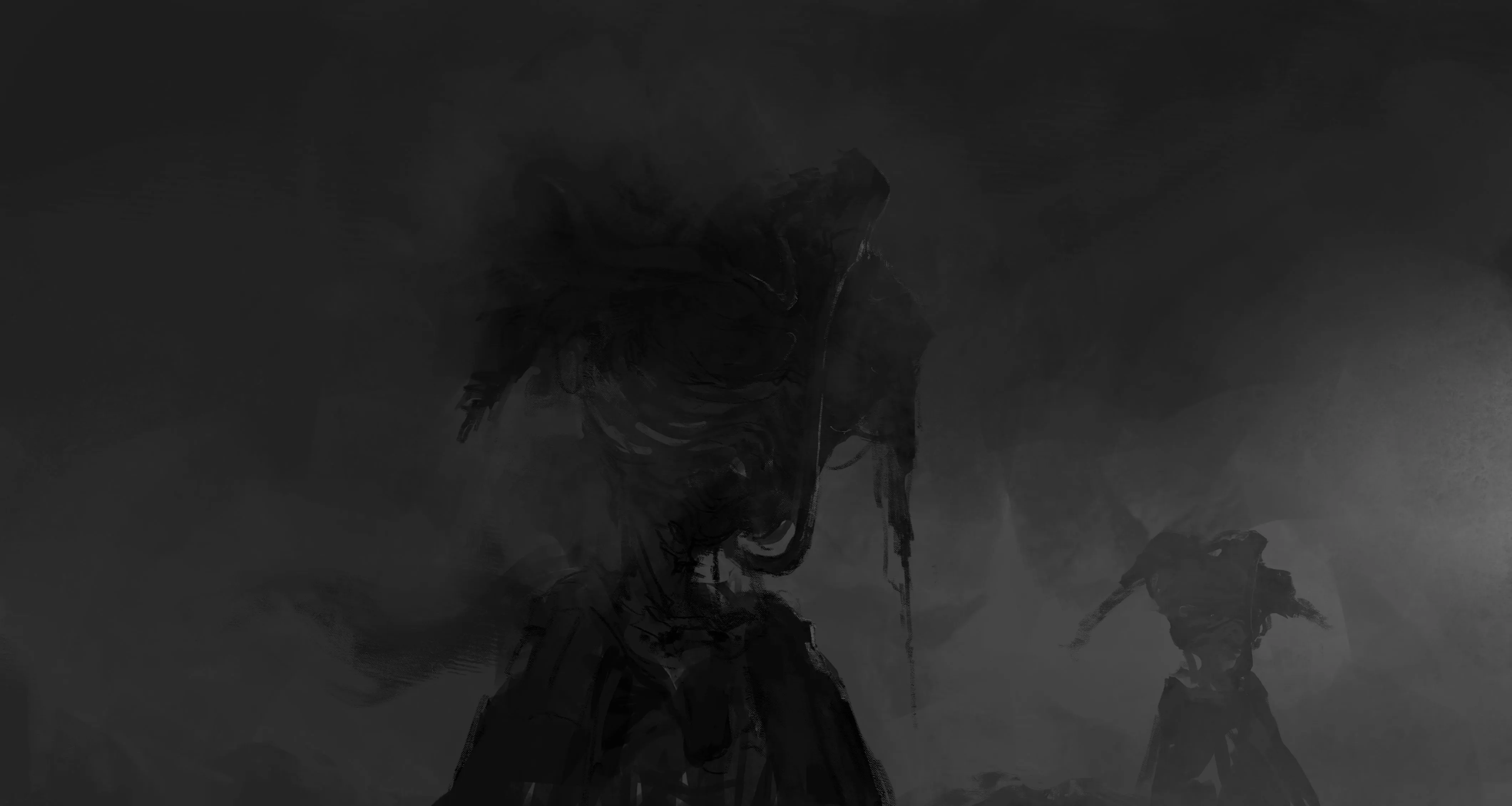
Arknights art

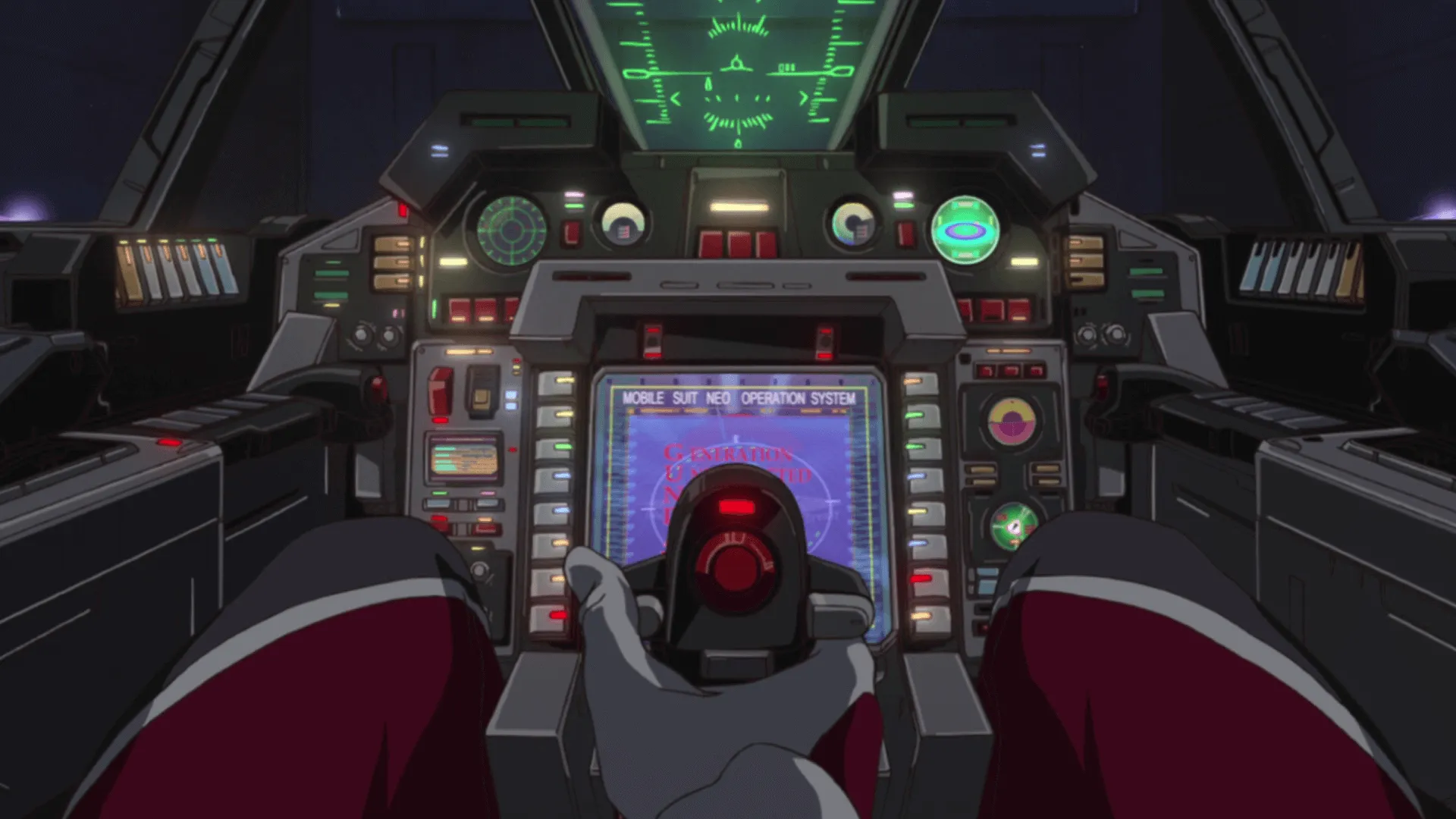
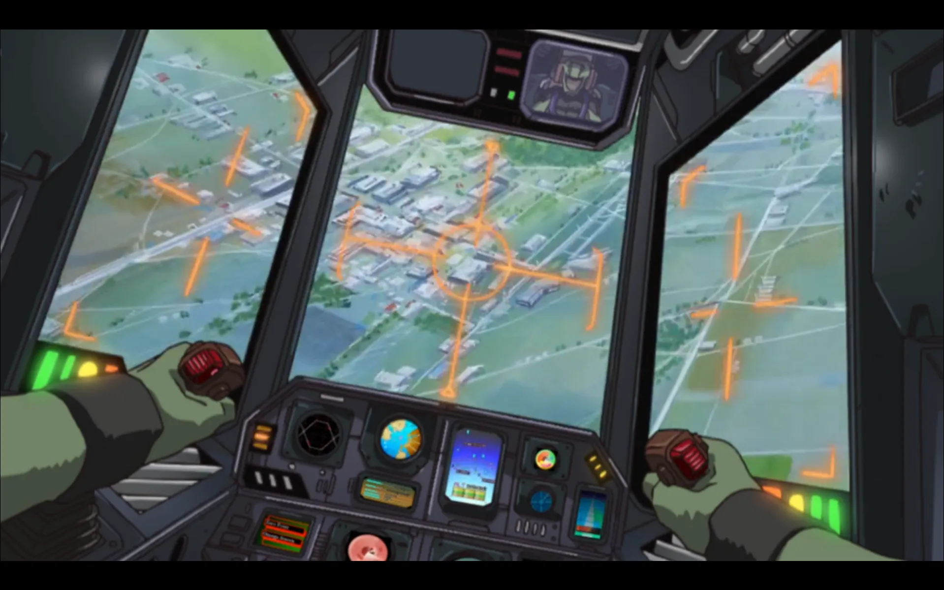
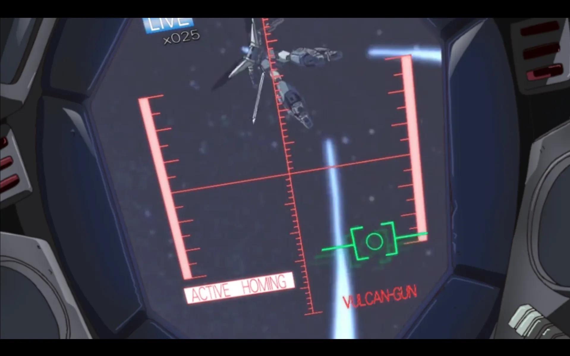
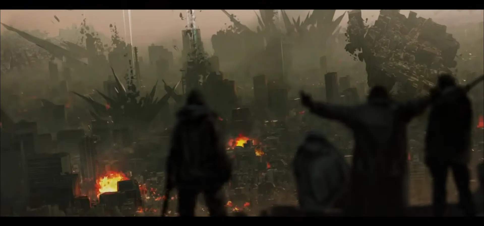
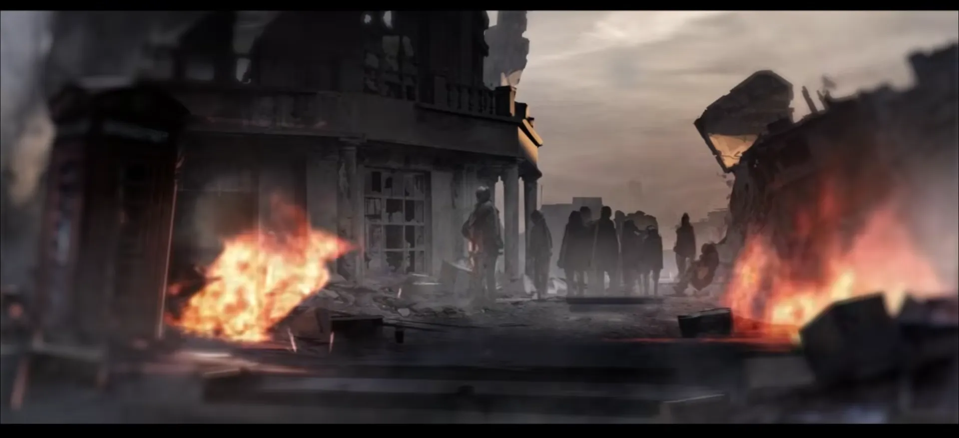
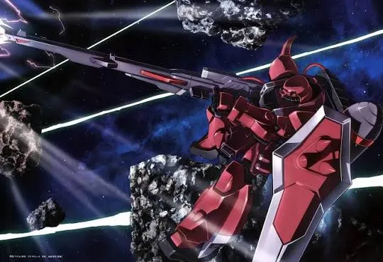
Gundam Seed Cockpit scenes
The inception of this “atelier” website traces back to a minor dispute I had with my father, whom had made a personal portfolio style website to display his projects.
I found his website to be quite plain and generally visually uninspiring, and gave him my criticisms plainly, to which he replied with his usual “It’s sooo~ easy to ciritise” and of course what he’s really saying is:
Essentially he’s challenging me to create a website of my own, to which I accepted and promised I would create a “cooler” website. During this time, I was a fan of Arknights and I had been itching to create something inspired by that style, so the idea came about that I could imitate the dark, grungy, tech-look of Arknights.
Buuuut, since before I was born, both my parents were great fans of Gundam and subsequently I to became a fan. And while I never planned to incorporate a little Gundam aesthetic, it was always in the back of mind. Specifically these scenes of the cockpits.\
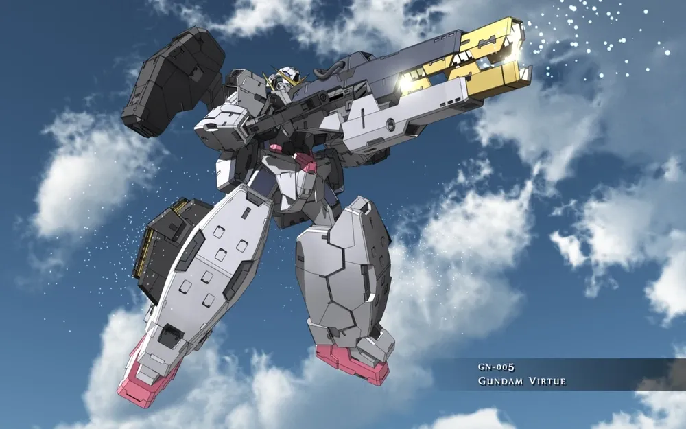
(btw, my favourites are the GN-005 Gundam Virtue and Hg gunner Zaku Warrior Lunamaria… Basically I really like big cannons)

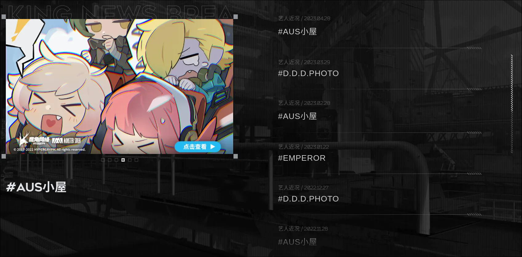
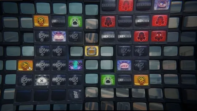
Arknights (Hypergryph) and Zenless Zone Zero (MiHoYo) have some of the coolest visual language and style I have ever seen. Zenless Zone Zero much less so, but the CRT monitor / arrays is specifically what I fell in love with.
| Design Element | Primary Reference | Target Execution |
|---|---|---|
| Grid & Spatial Layout | Monster-Siren-Records + Hypergryph | dark + interesting backgrounds, thin border grids, high contrast text |
| Viewport Post-Processing | Zenless Zone Zero | Analog CRT scanlines, flicker transitions, subtle noise overlays |
| UI Components | Arknights (Game) | Custom cursors, glowing status indicators, monospaced metadata |
| Loading Screen + Music Player | Monster-Siren-Records |
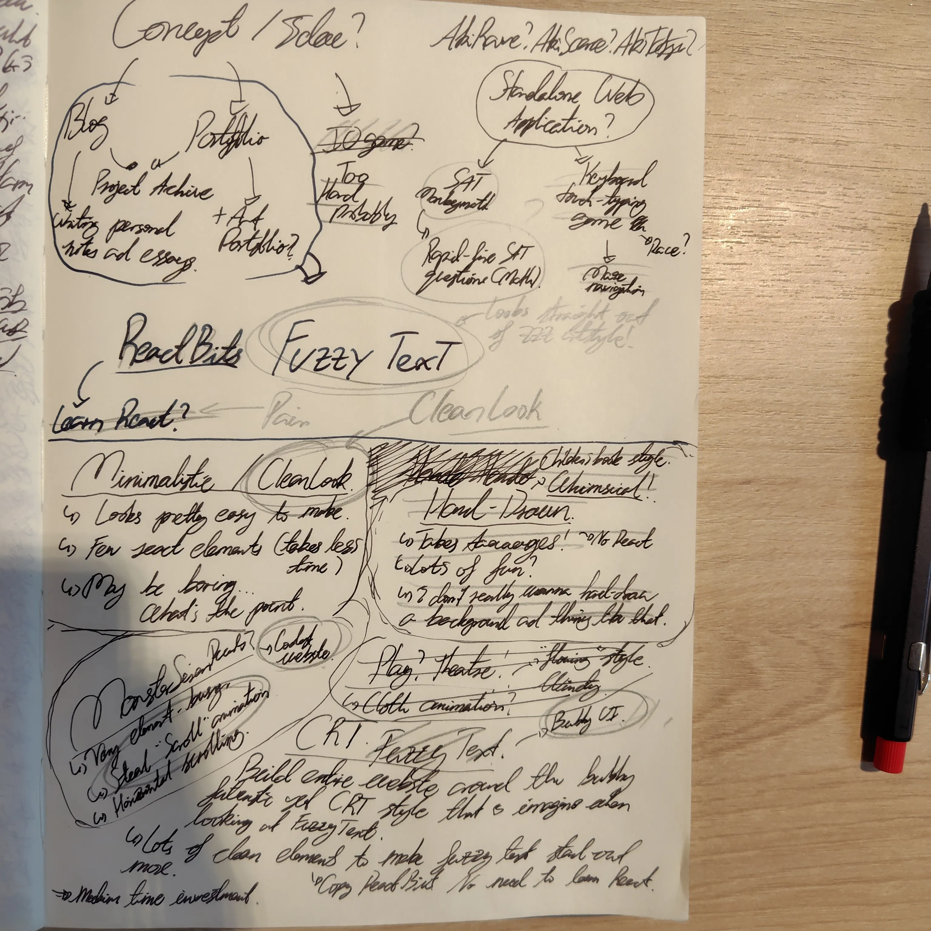
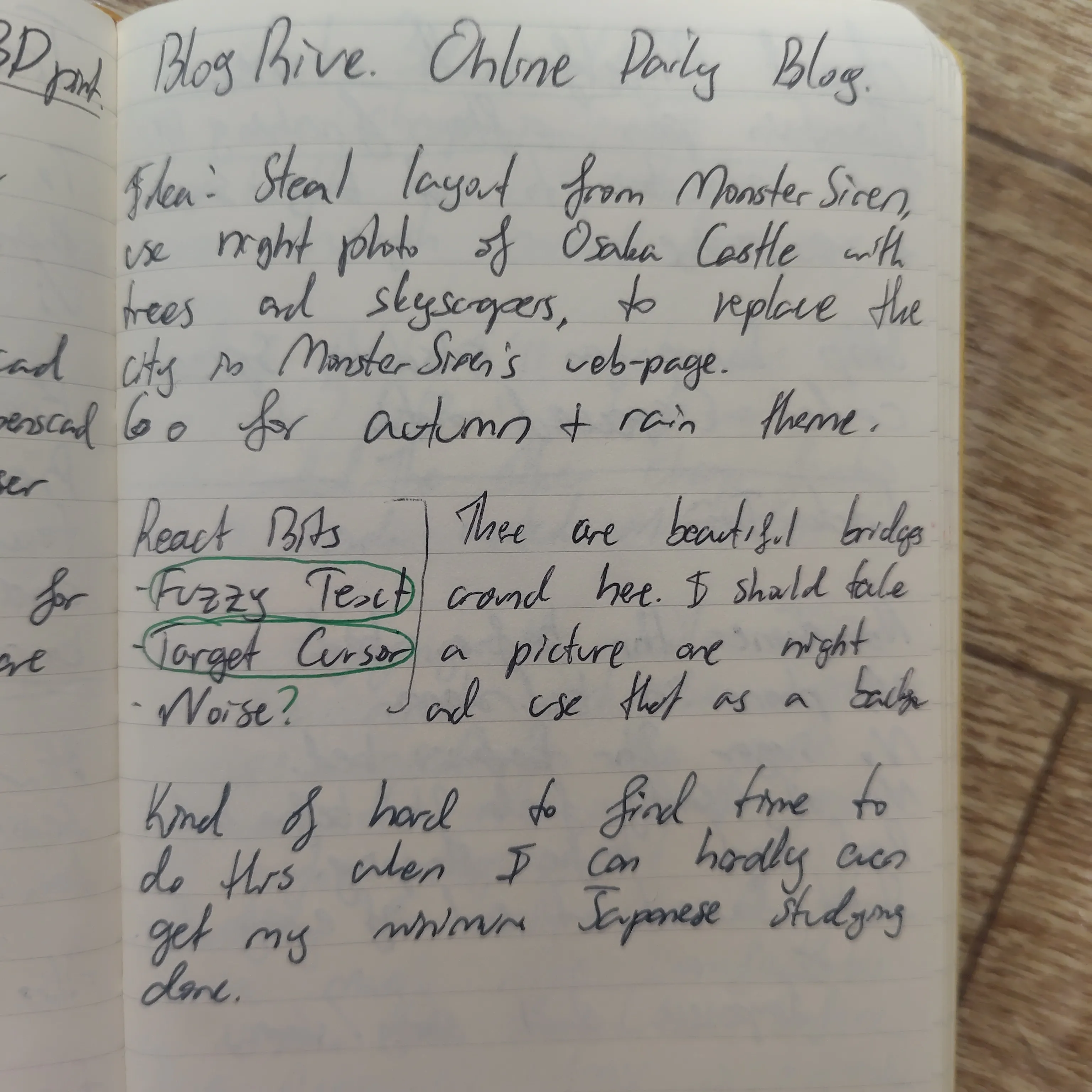
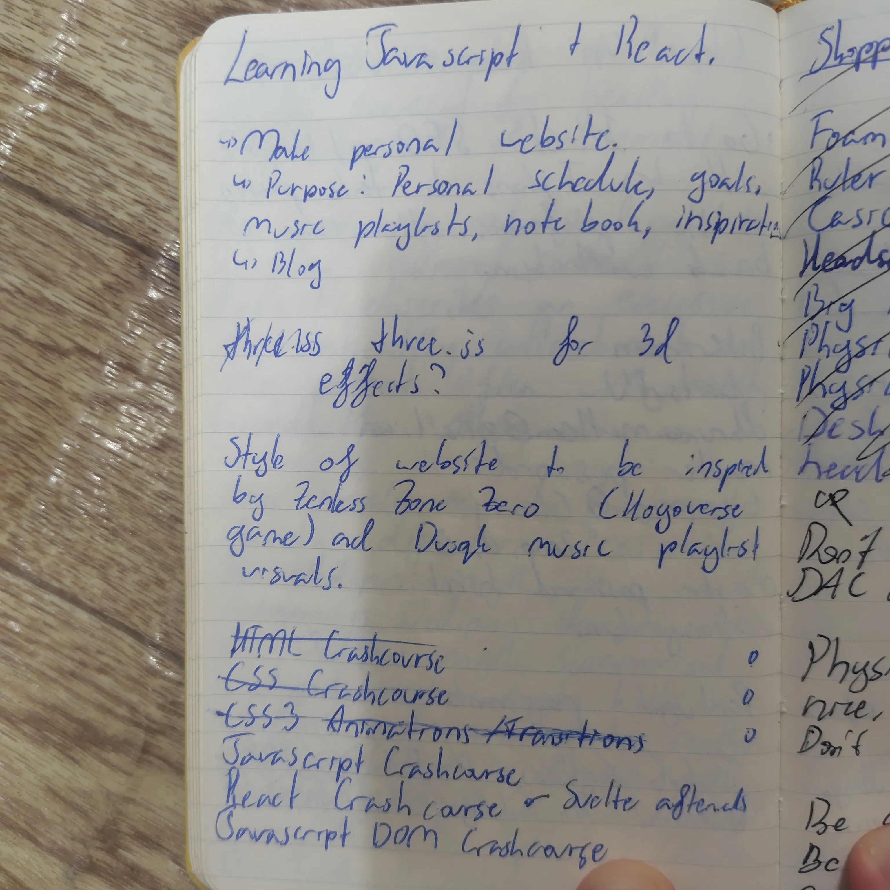
The initial brainstorming in the Library
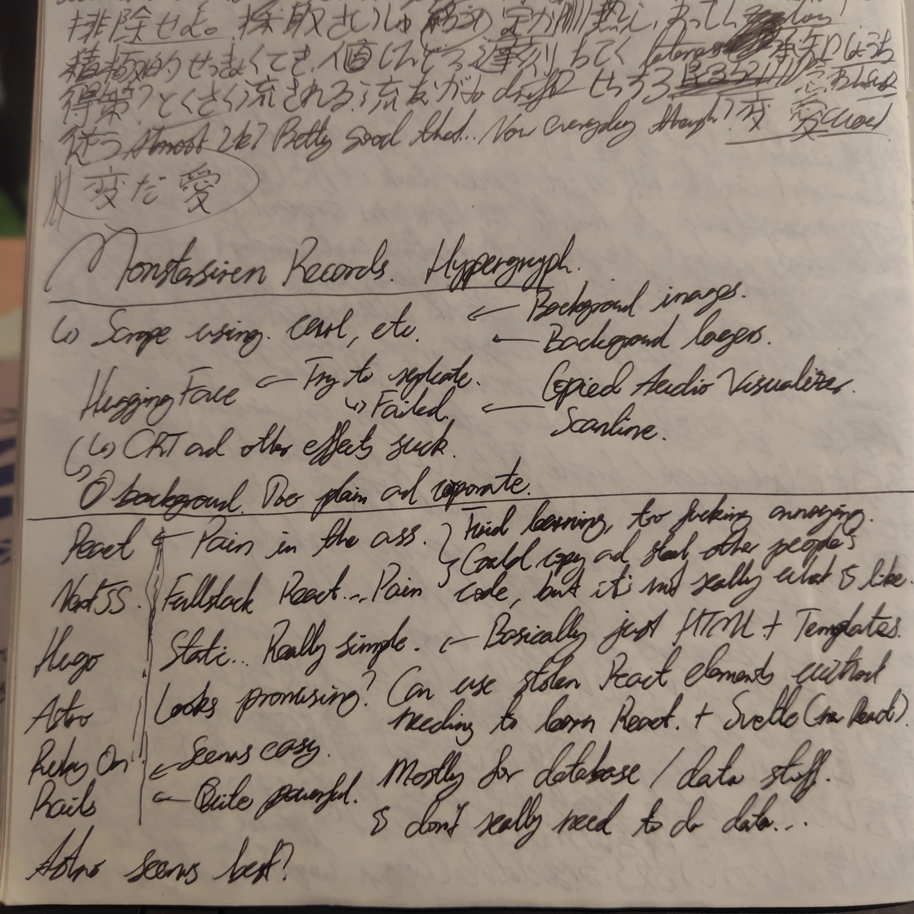
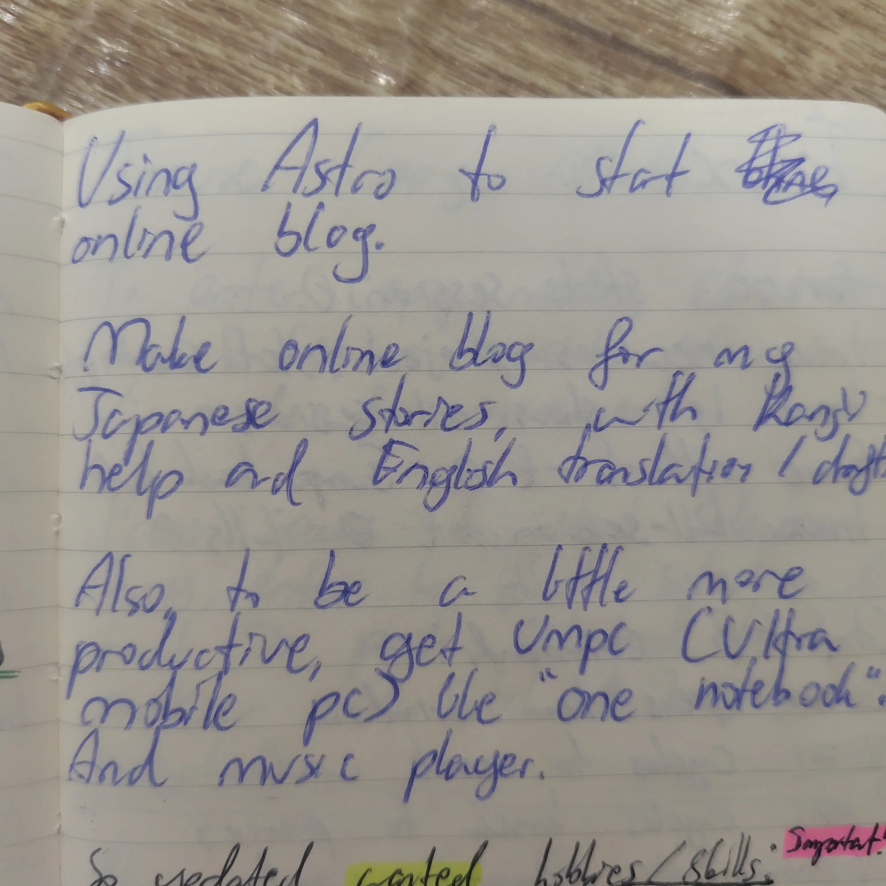
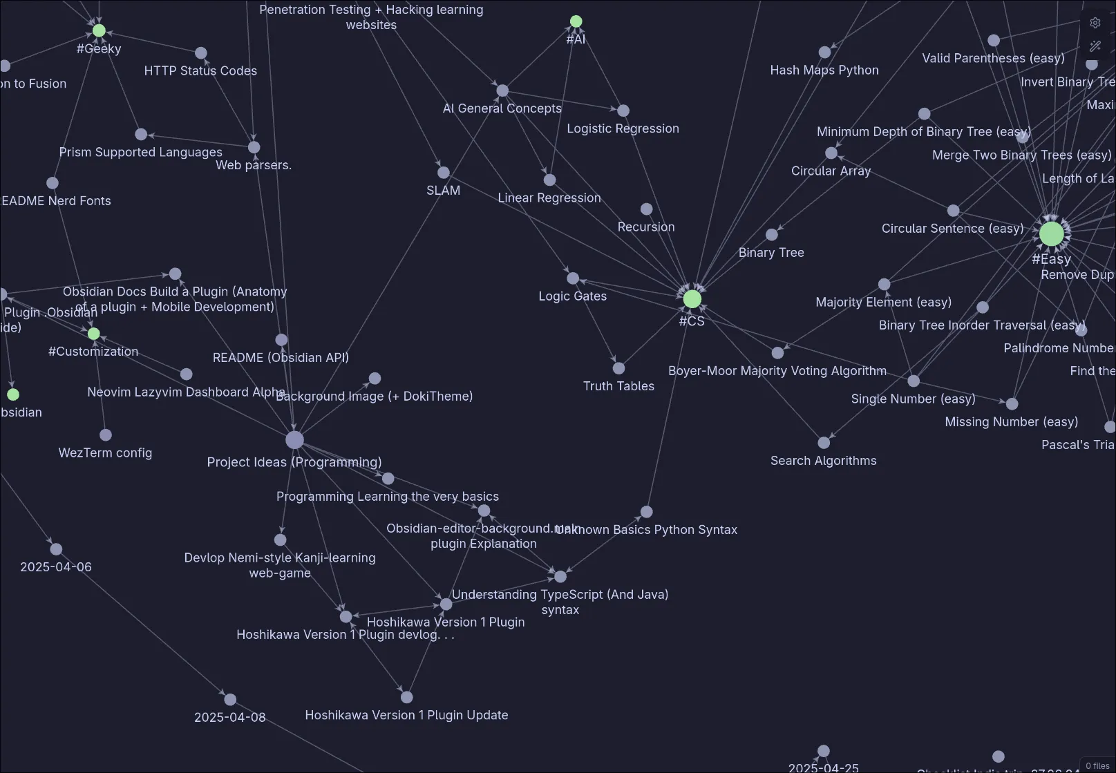
These brainstorms on the right are all that remain from my first day of building my website.
I was aware of “Reactbits” already, and was fully intending on relying on their components as cornerstones of my website. “Fuzzy Text” specifically.

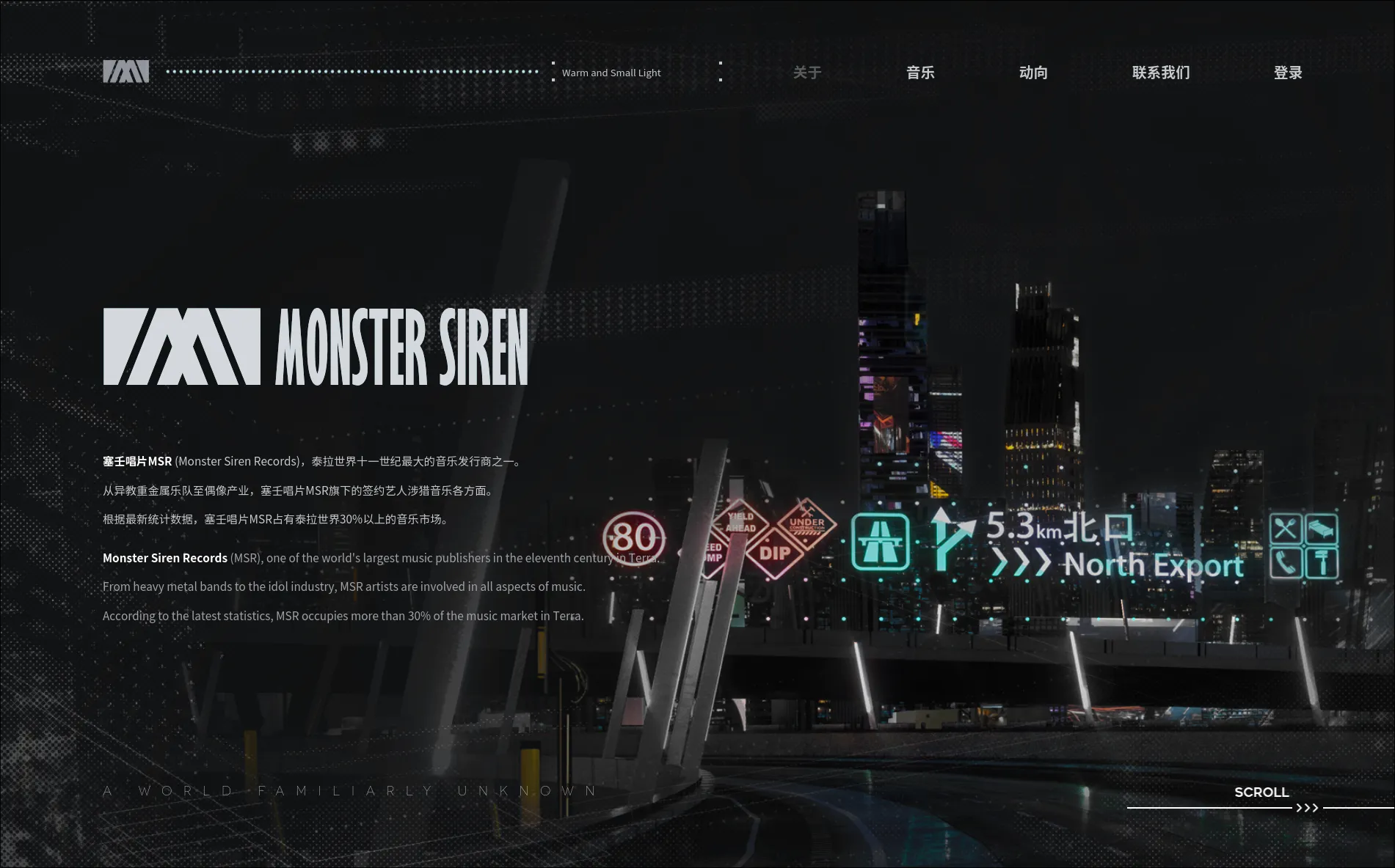
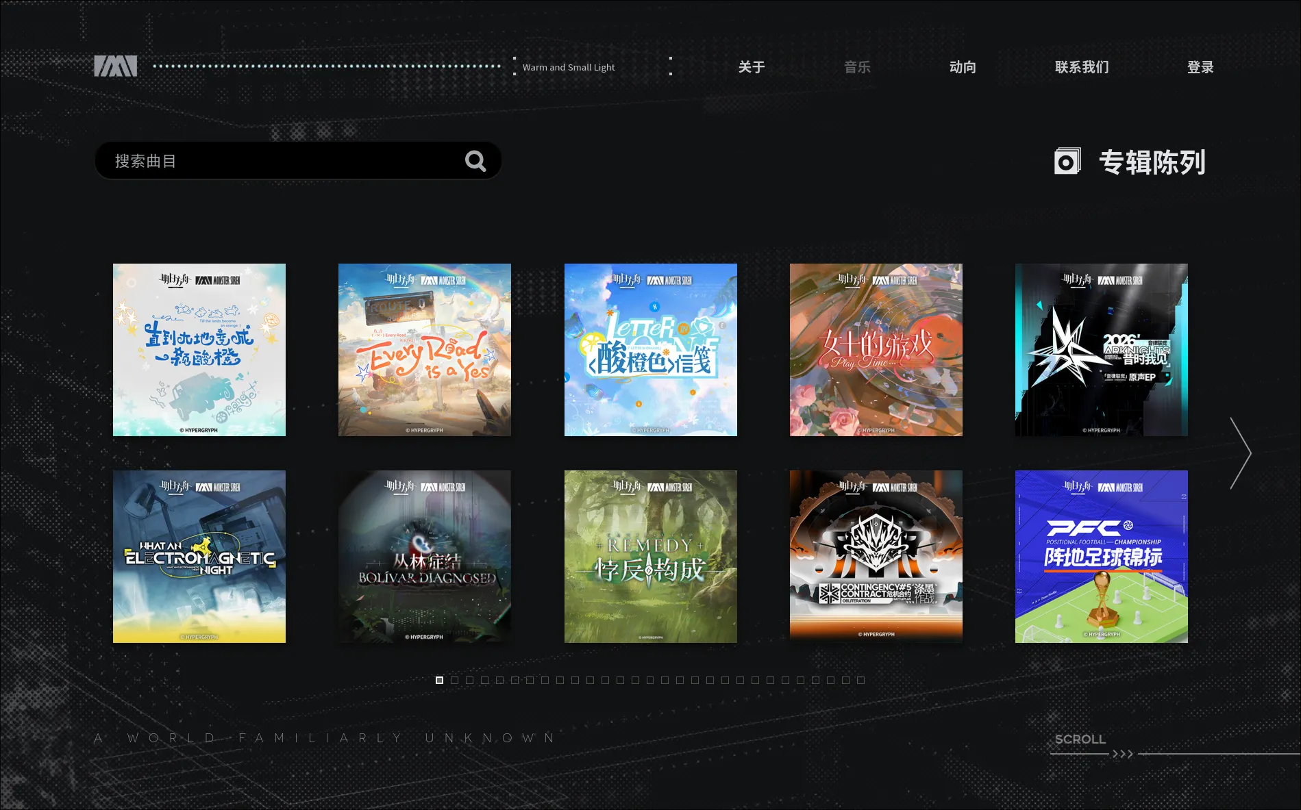
I love clean digital spaces, and initially I was intending to make a simple and clean personal website as well. However, my favourite website that I frequented often was Monster-Siren-Records (An Arknights Radio essentially), which is heavy with dynamic and visual elements reflecting the artstyle of the game.
Arknights despite being a mere mobile game has produced so much amazing music in pretty much every genre, I’m always curious to hear what their new tracks are. In terms of art style and aesthetics it’s also incredible so I started looking more into it as I took HTML and CSS courses online.
After finishing the HTML + Javascript and CSS online beginner lessons I made version1:
So at this point that I thought I would go steal as many elements from the Hypergryph Monster Siren website as I could, so it started out as a black background with side-scrolling.
On the Hypergryph website, they somehow made it seem like the input of scrolling with the mouse is jacked and it actually scrolls to the side and in my attempt to copy this I wasted many, many hours.
Eventually I did manage to make it work most of the time by jacking the scrolling input into horizontal scrolling, but this breaks horizontal swiping. So in the end I removed it, as not being able to have proper scrolling feels like grinding my mind’s dick through a wood-chipper.
It would have been amazing if I still had that website attempt lying around somewhere, but all I have is my side-scroller animation mimicking Monster-Siren-Records.
I also wanted to have an audio visualiser on the top left just like Monster-Siren-Records, which I left entirely up to Claude.
From here, I only then somehow found out about the huggingface Deepsite AI website (makes you a website with a single prompt). So of course I immediately waste all my free tokens trying to make it copy the Monster-Siren-Records. And the website it produced was cool and clean though not really what I was looking for, so I salvaged it, stealing the scan-line, crosshair cursor, menu-items, and the logic behind the wobble for the “Hello Friend” text. Now that I have seen many websites and personal portfolios, the issue I find with AI websites is that they ALL look so generic they actually become the most ugly, this includes those with 3D animation.
So after a good many months after I started trying to make my website, Zenless Zone Zero came out and I would have had 0 interest in the game had I not seen how they mixed distortion and cuteness in their advertisements. The CRT monitor array / navigation with the bangboo was such a cool and amazing idea to me that I became determined to incorporate something like it in my project. Together with the release of Balatro (which has amazing CRT effects) I fell in love with CRT distortions (I even started using Cool Retro Term).
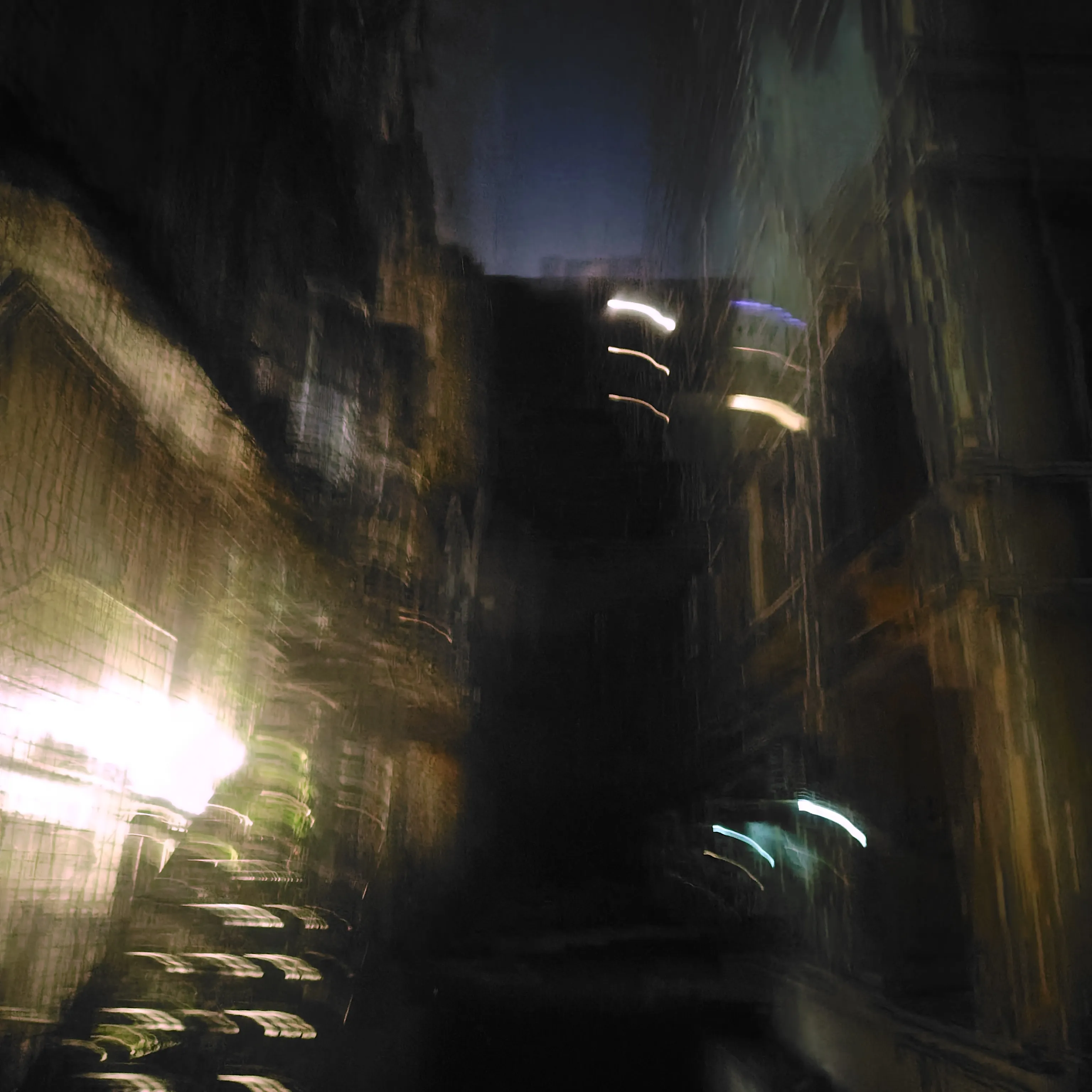
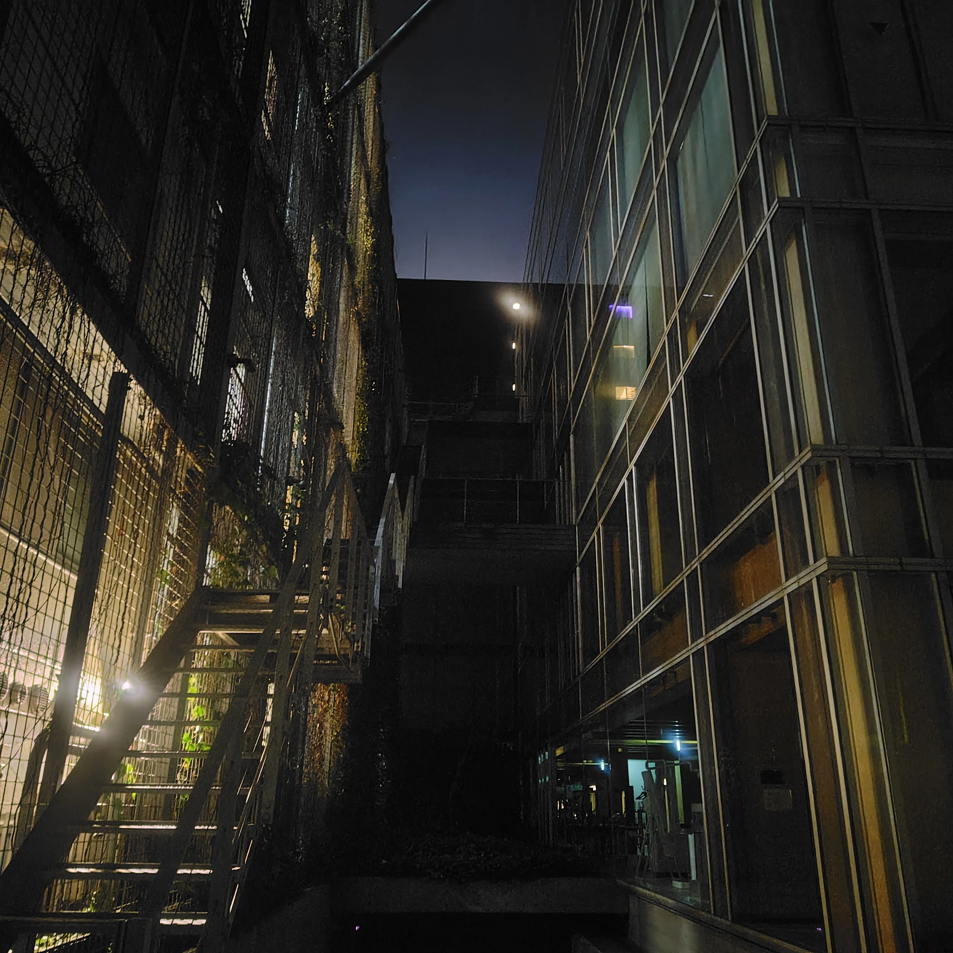
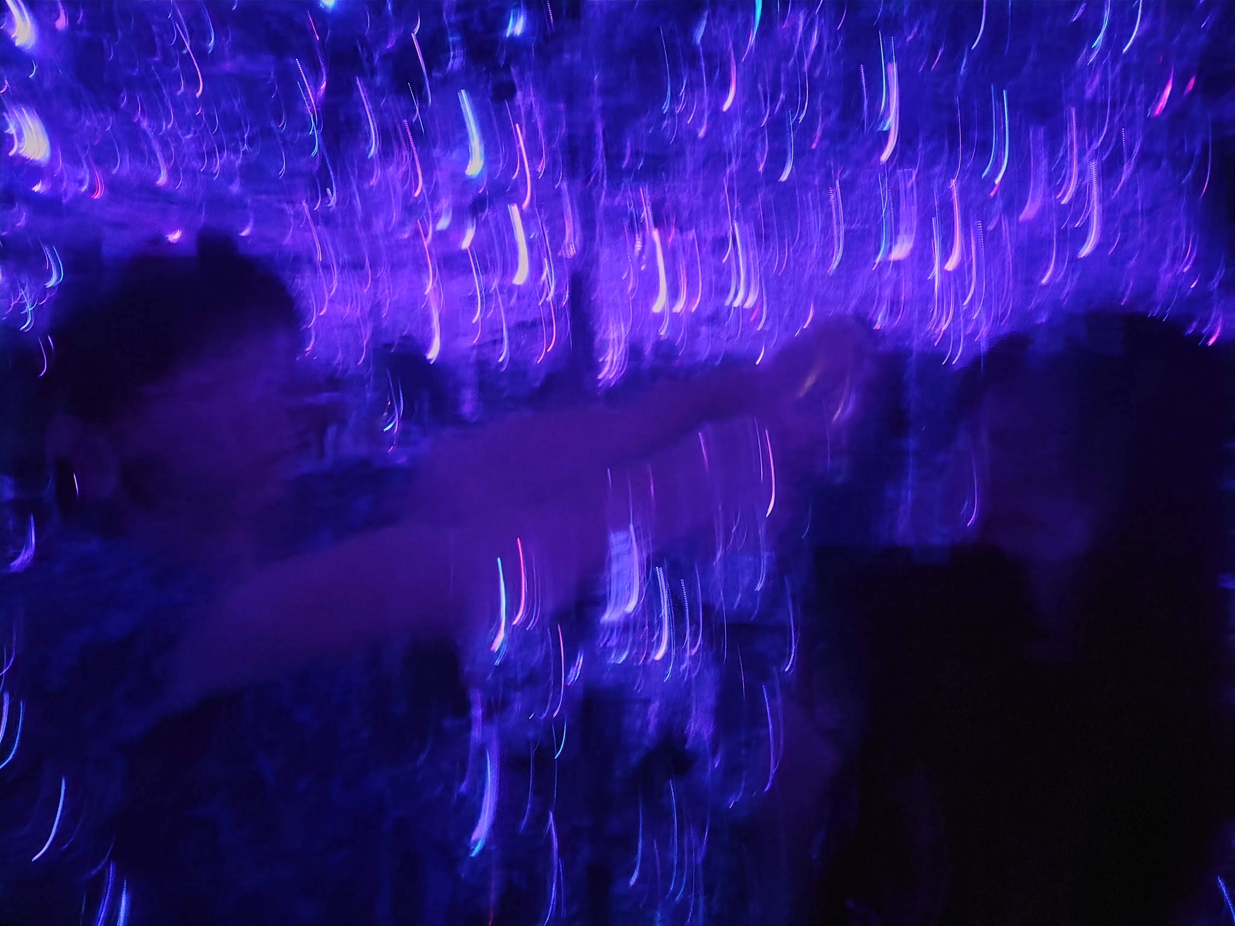
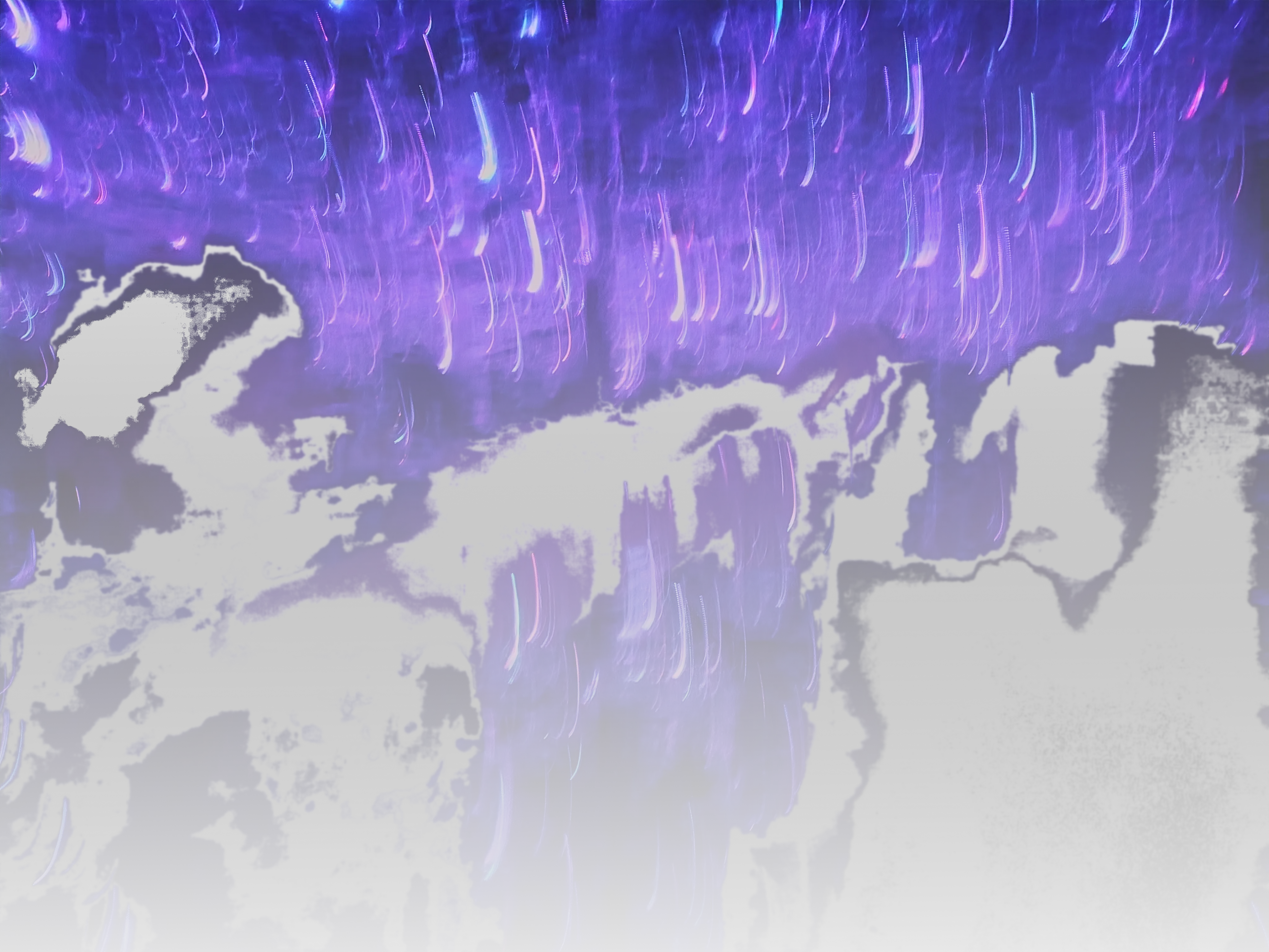
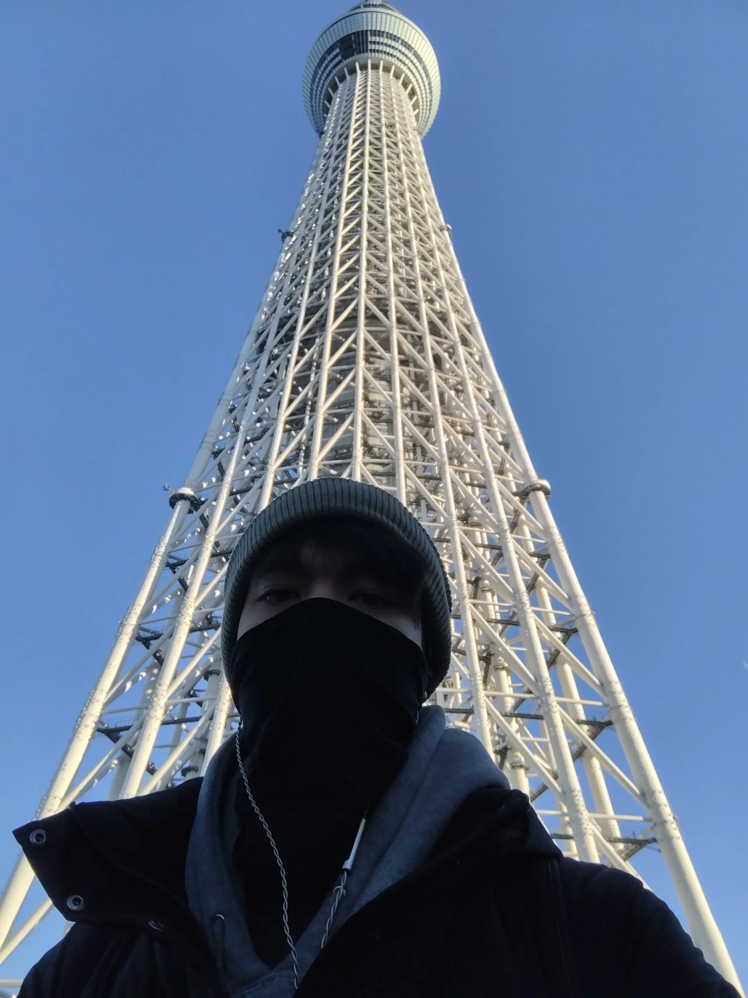
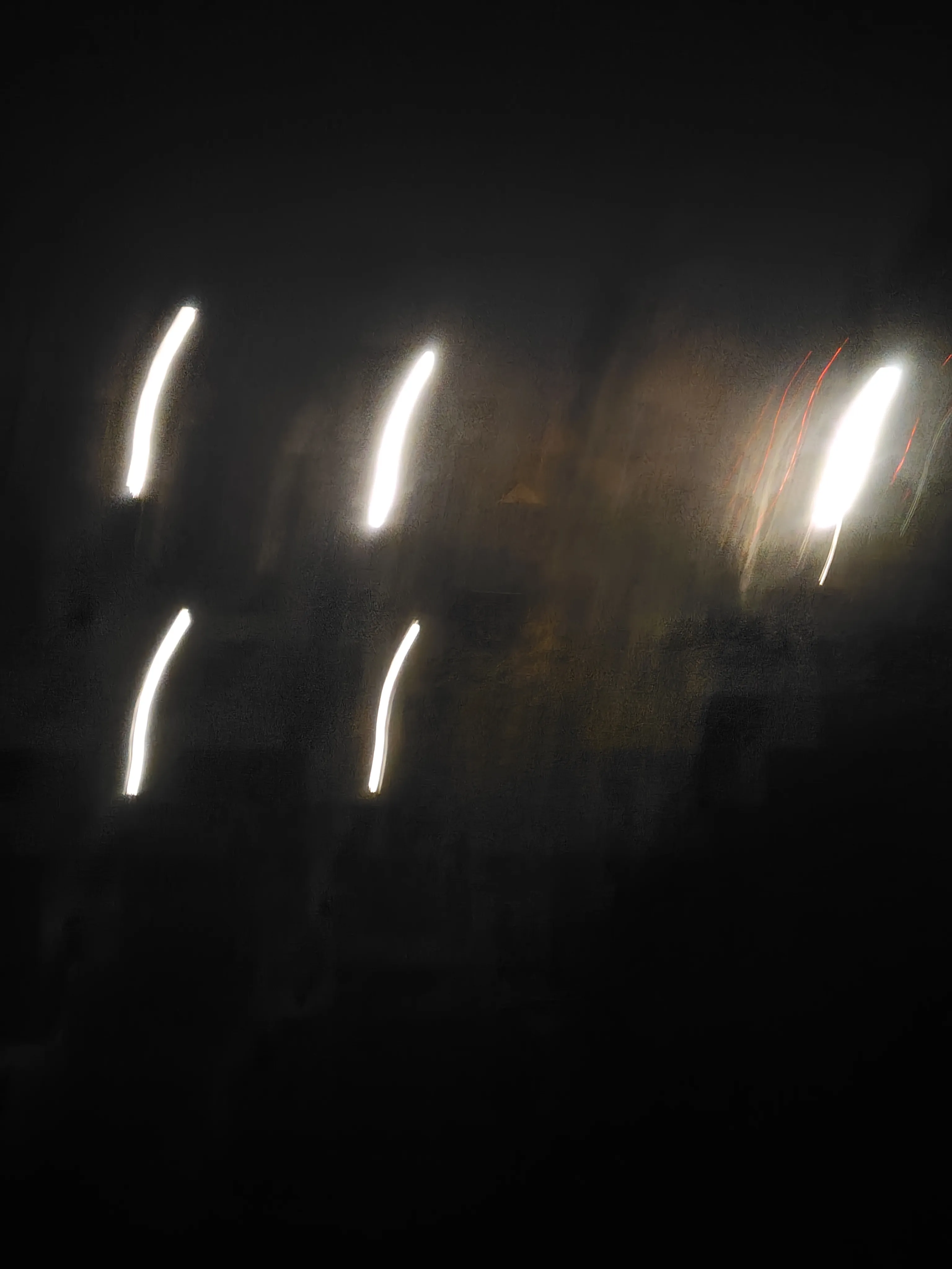
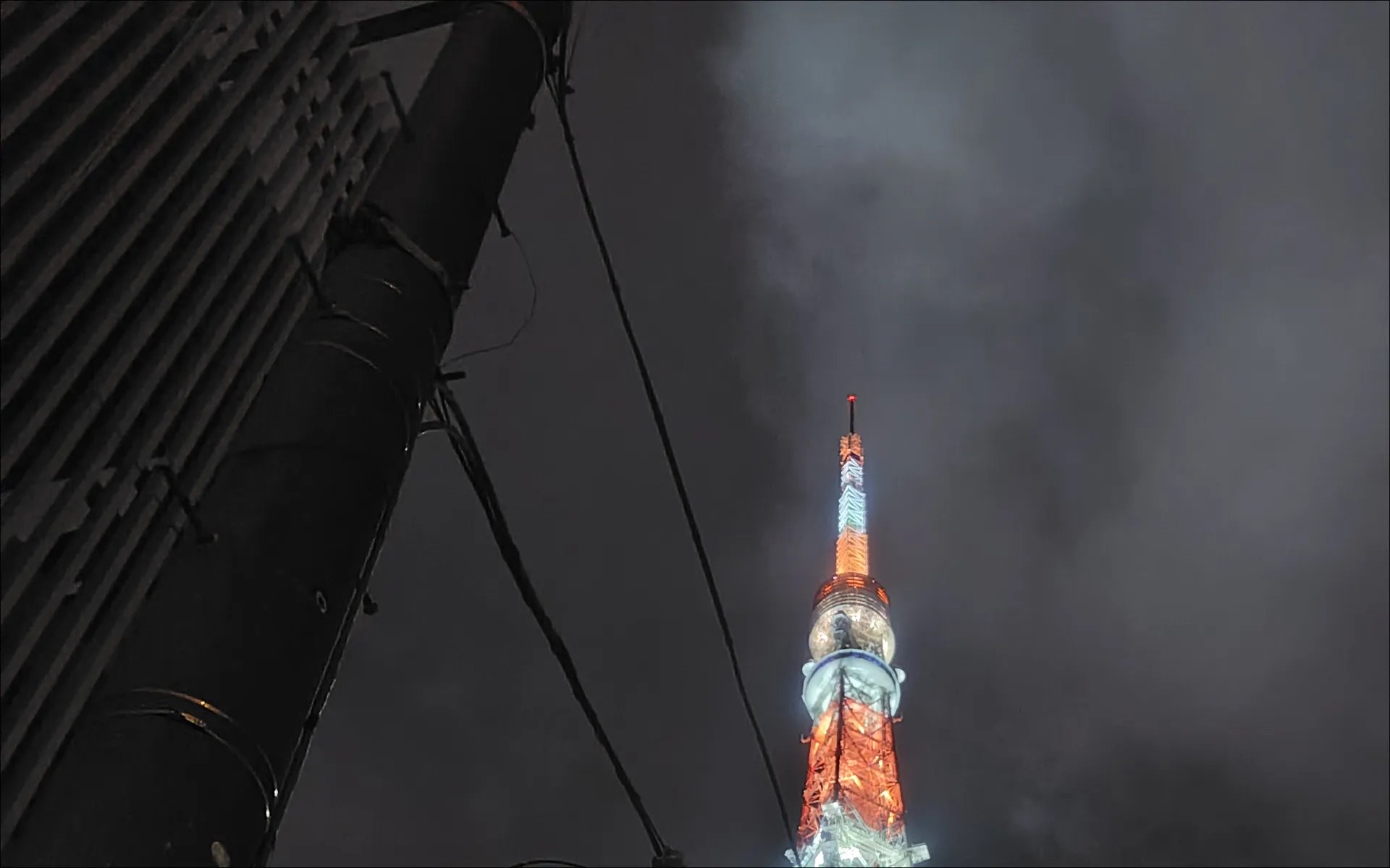
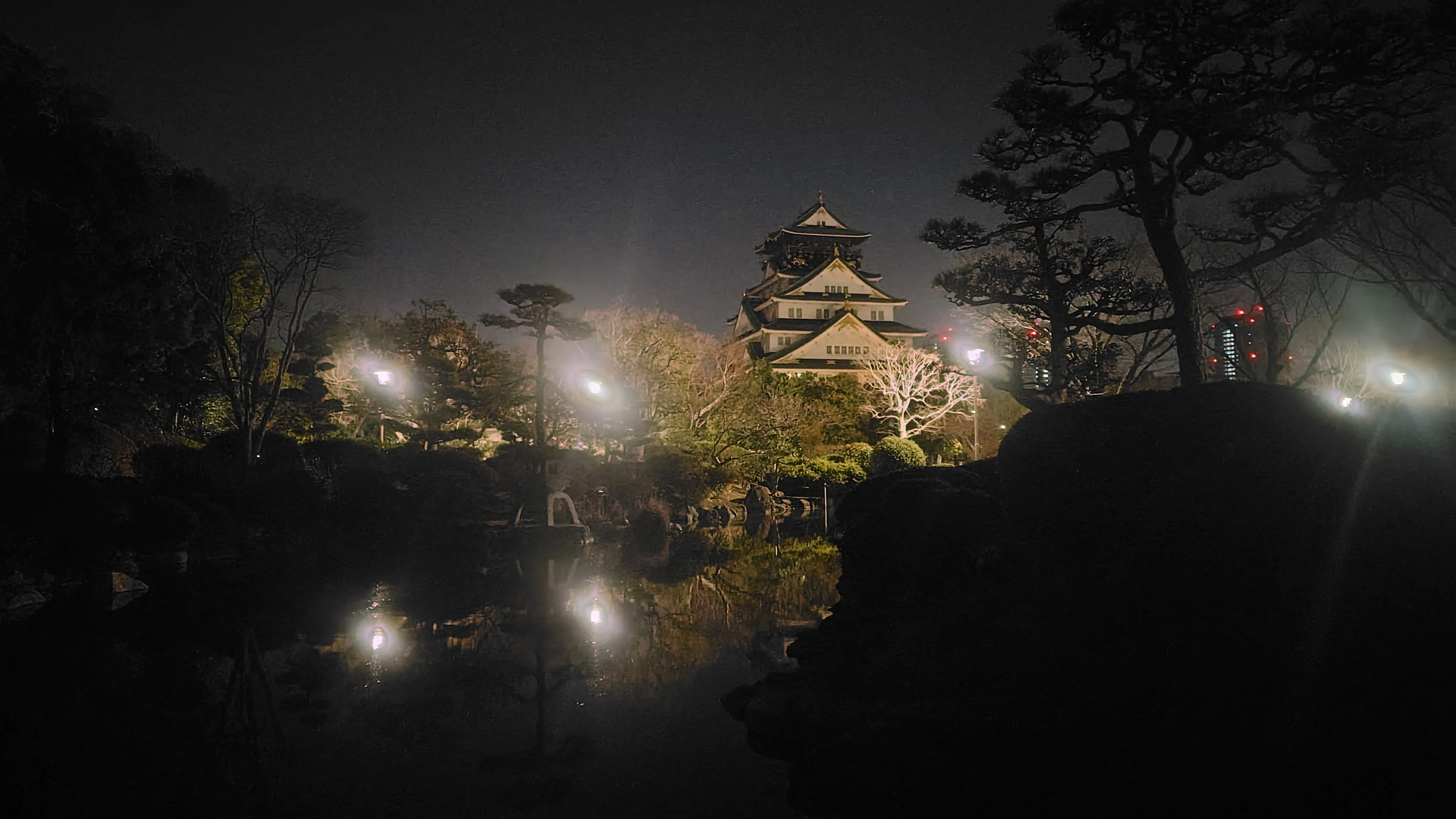
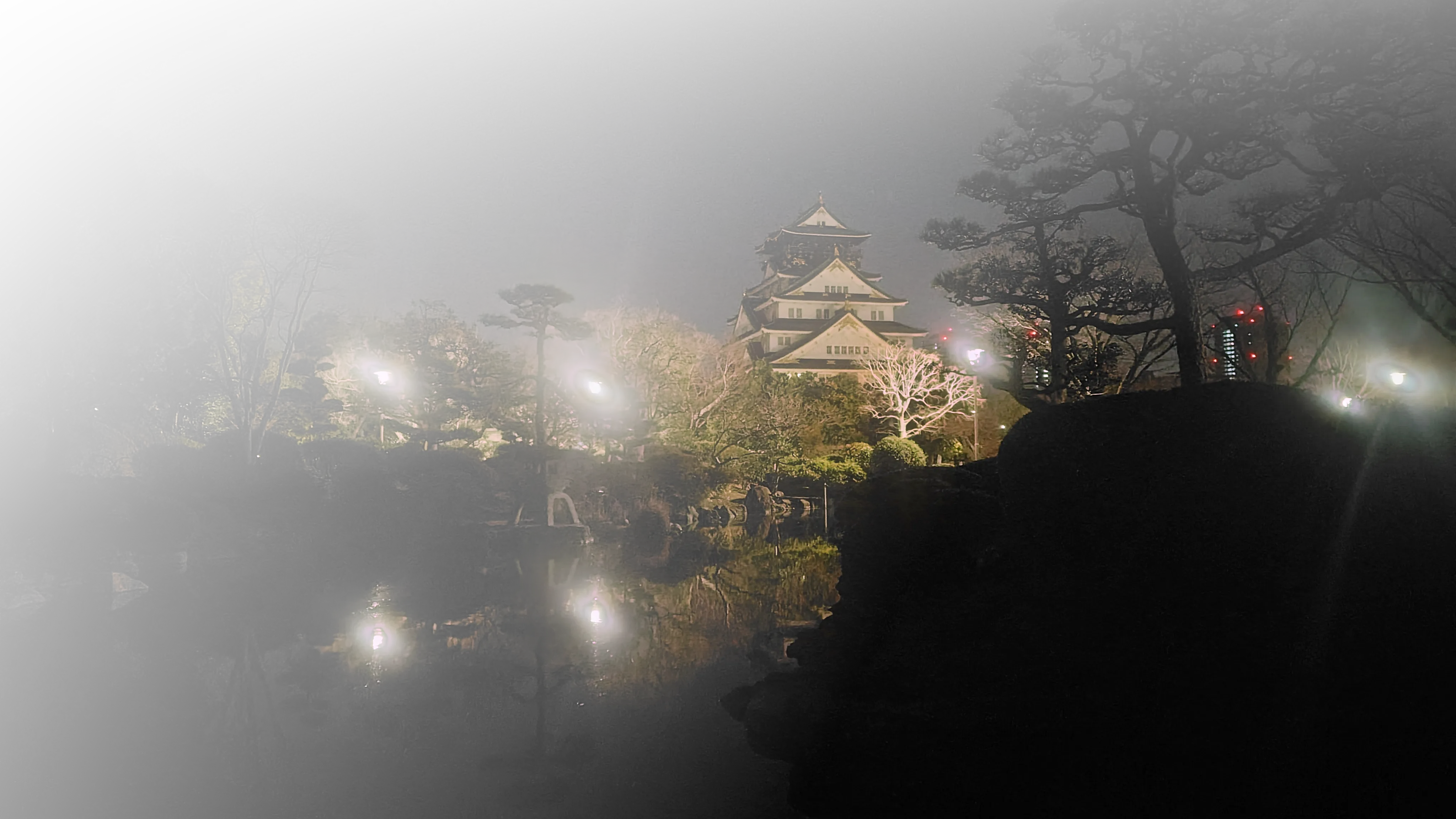
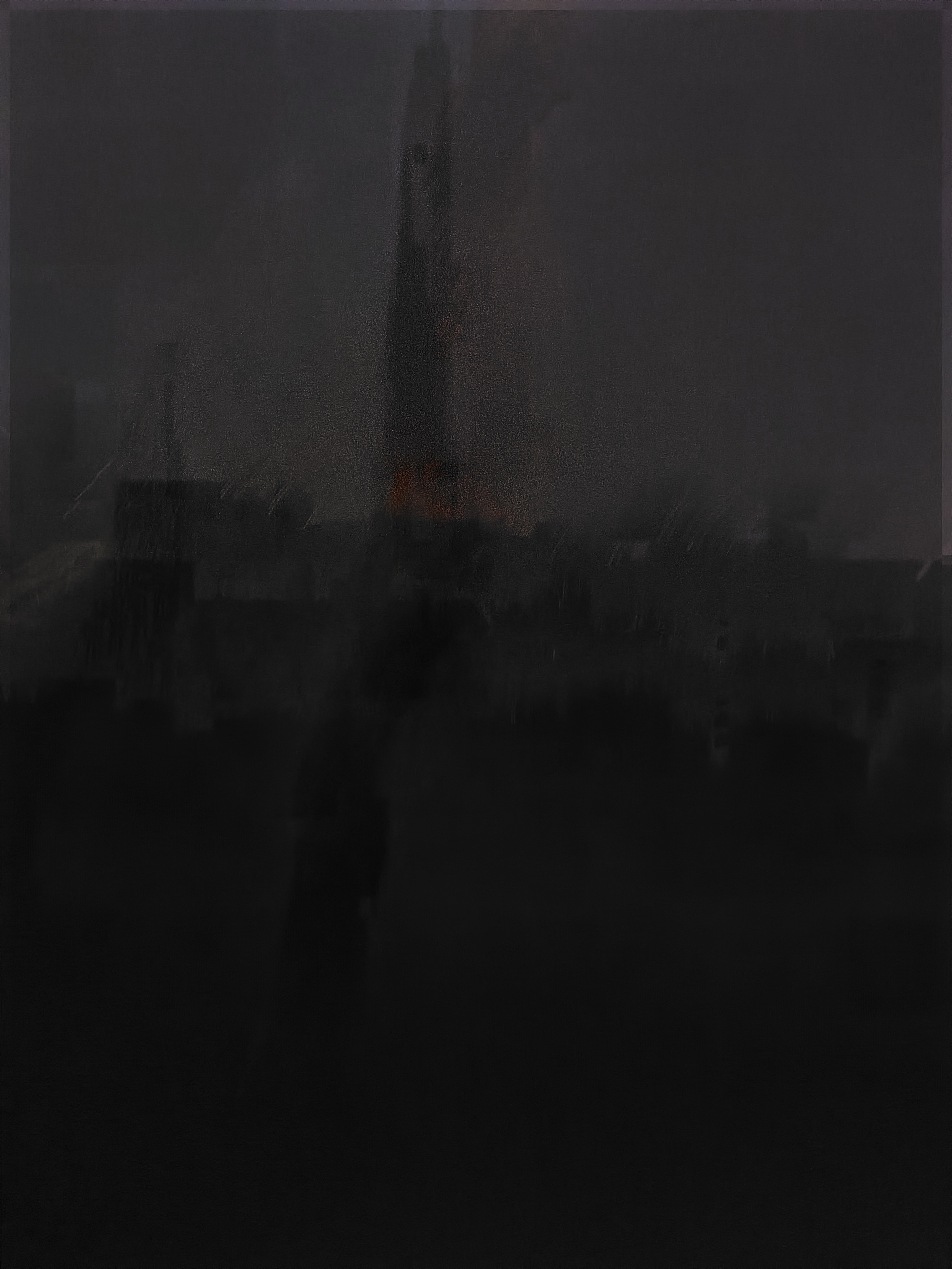
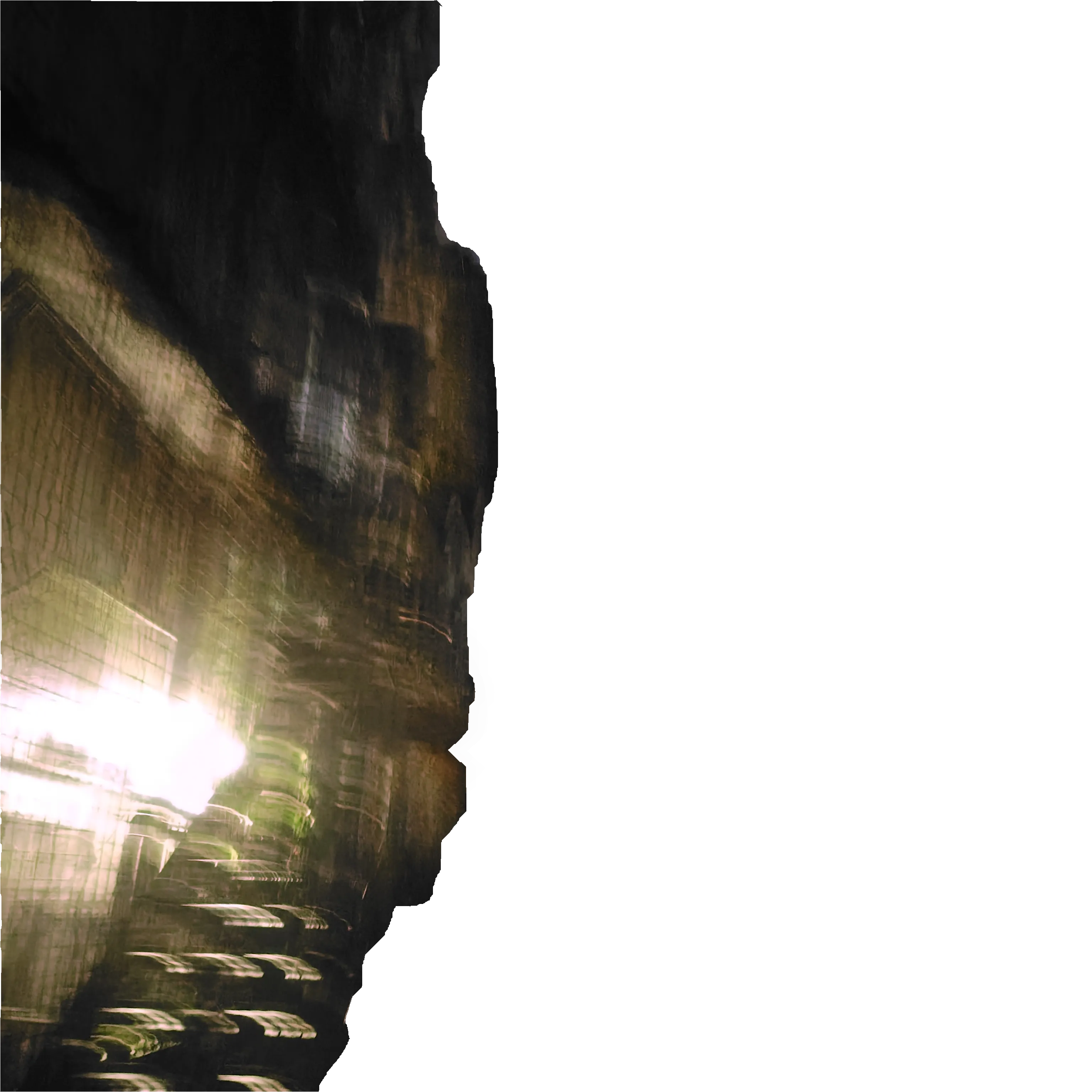
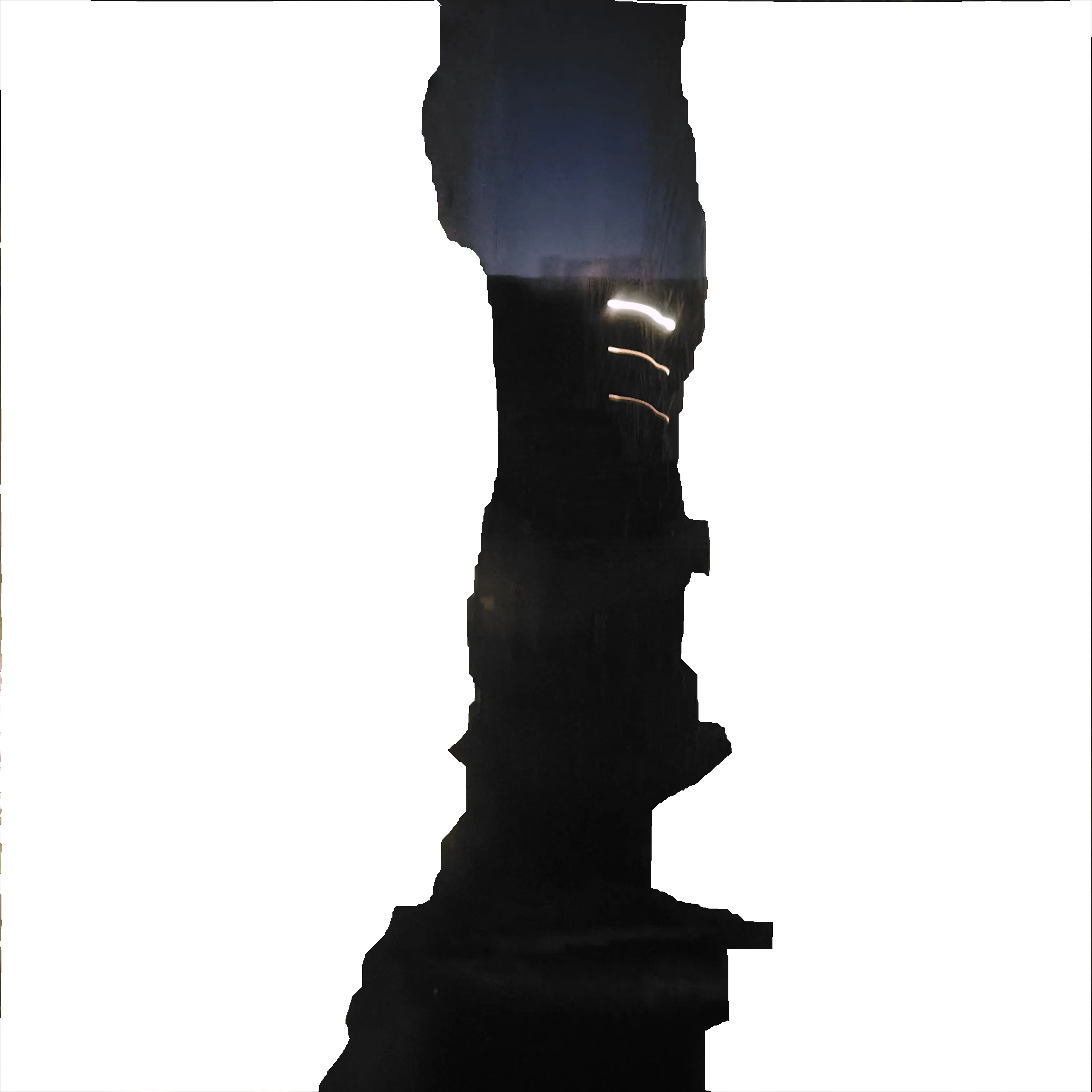
All the images (backgrounds) where taken by me with my wonderfully amazing unreliable phone camera. (I use a Acquos Sense 9 btw) This piece of shit, I mean incredibly artistic piece of kit has transformed so many of my photos that i’ve almost come to embrace this “feature”. You see, at certain, seemingly random times when I wish to take a picture, the phone will show that the photo has been taken (with the thumbnail in the corner and everything), while hiding the fact that the sensor is still exposed. So when I go to check the photo, moving the camera the photo takes a couple of seconds to “load” (shutting the apeture) and I see a complete mess that looks nothing like the thumbnail I was shown! What an absolute nightmare.
For example: My blurry stairway photo. The clear photo besides it I took the night after. Embracing the whims of my camera, I knew that I wanted to use this blurry stairway picture I took for the some section. My first idea was to just edit out the walls, skew them, and apply an opacity gradient on them to make it look like they go on forever, fading out, leaving a middle section 1/2rd the width of the viewport to have the blog portals. But it just kept on looking weird, and I have so little experience with GIMP. So in an attempt to comprimise, I split the photo into 3 parts and used them for the unique transition animation.
For the Home section, I was originally planning on having a wireframe of some buildings in Osaka, or a Arknights Stylised picture of the Osaka Castle, and I even tried getting Gemini Nano Banana to produce something. So I gave up, and wrote this kind of introductory paragraph. And then, only after moving it to the side did I realise that a clean Osaka castle picture taken by me would probably look best anyway.